

A Pretend Title
A Faux Book Cover Assignment, Step by Step - Part 1

So last year, I wrote a post for new illustrators. One of the suggestions I had was to give yourself assignments when growing an art portfolio. Make sure the project has parameters. Don’t just draw what you want for fun: you want to have all of the constraints of a real assignment. Anyway, fast forward ahead to this month, where I’m s-l-o-w-l-y working on updating my own website. One area I’d like to work more in are book covers and I thought it would be helpful to show a recent example of that. Enter: a self-assigned project.
Step 1: Create a Brief
A Brief is what the client sends over, the scope of the project (one front cover), the time frame (due by March), who the target audience is (middle grade readers), and either the full manuscript or a synopsis of the story. My synopsis for this imaginary title:
Leaf on a Branch is the story of Leaf Pilkington and her unexpected journey to learn who she is and what family means. Leaf is 12 years old, precocious, quirky and full of dreams and ambitions. She lives with her parents and older brothers in the small town of Wiggins Mills, Pennsylvania. Following her grandfather’s death last year, Leaf’s Grandma Sue has come to live with the Pilkington family, due to rapidly progressing Alzheimer's.
But this family upheaval doesn’t slow Leaf’s roll. She’s on the school softball team, a straight A student and on track to become the youngest member of the Green County Daughters of the American Revolution. While working on her family tree to gain DAR membership, Leaf decides to take a DNA test, to confirm her research. But Leaf’s results are a bombshell: her test reveals that she’s 25% Polish, meaning her grandfather isn’t really her grandfather. And the only person who knows the truth of the story is Grandma Sue.
But Grandma Sue can’t help Leaf. She struggles to remember her name, much less the events set in motion 50 years ago. Leaf scours the library, messages distant relatives, but has run out of answers until one night, she trips into a time slip. Caught in between the past and the present, a 17 year old Grandma Sue appears. And together, she and Leaf will solve this mystery, before it’s too late
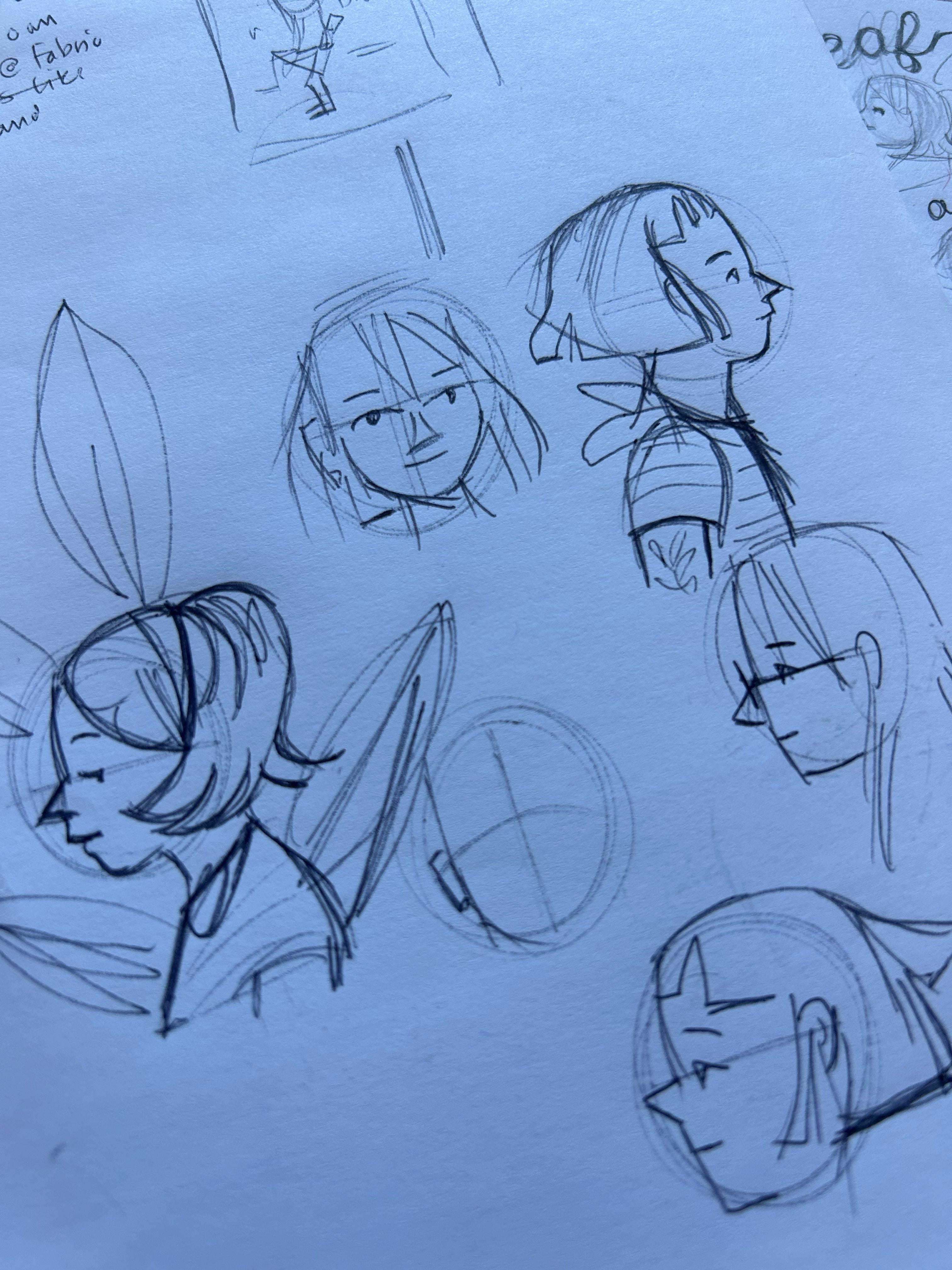
2. Character Sketches
I began first with character sketches, working to unearth Leaf’s look. The top image shows that process — it’s never linear. Some characters just jump off the page. And some characters take awhile to understand and visualize. It’s completely woo and there isn’t any rhyme or reason involved, just an innate knowledge that this is the character. I keep in mind obvious visual cues stated in the manuscript (the character’s age, appearance, ethnicity, etc.). But I also try to think about clues to the character’s appearance that aren’t obvious. For instance, if she character is self-confident, arms akimbo makes sense. But if the character is more introverted, perhaps they’re holding an object or their arms are folded. Maybe they’re playing with their hair.
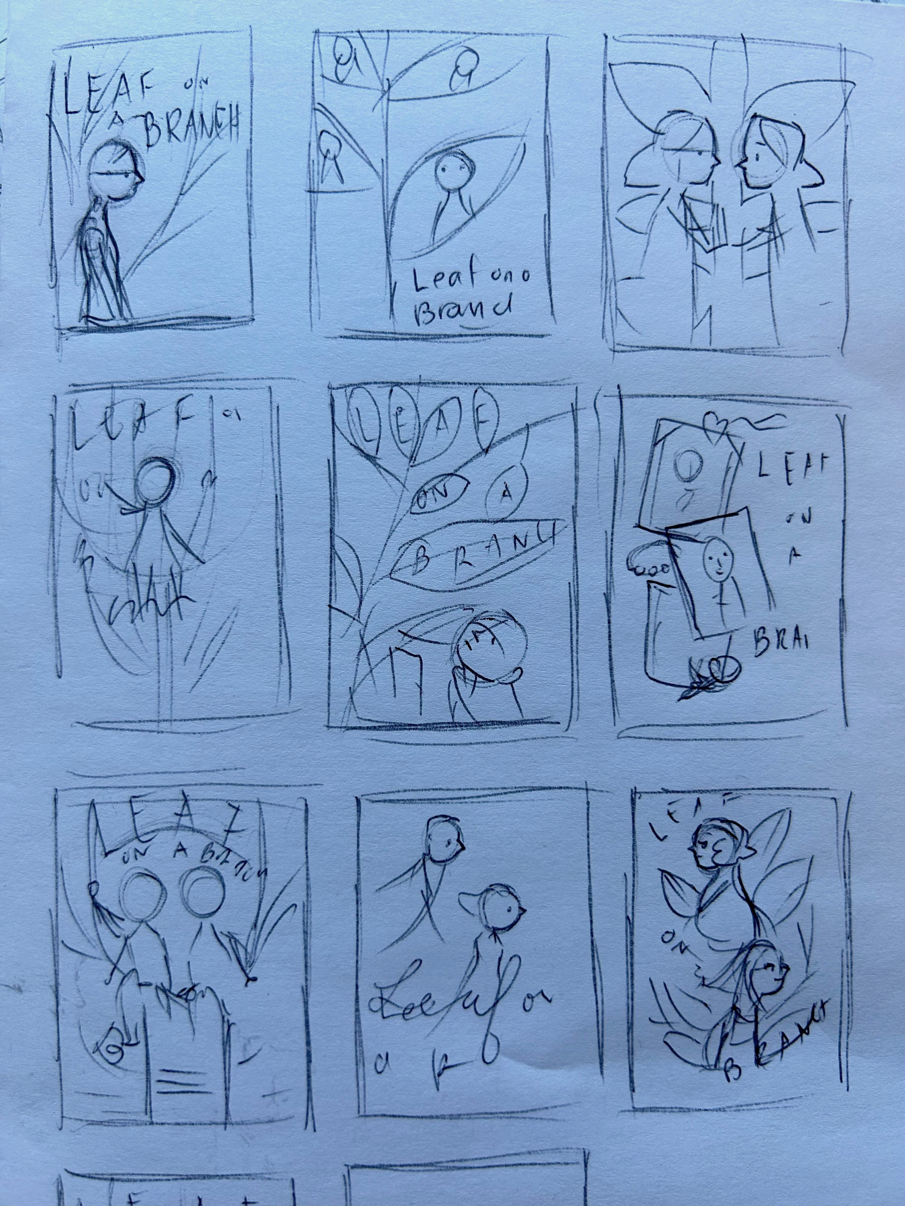
3. Thumbnails
Thumbnails are itty-bitty, rapid fire sketches. The images above are probably only about an inch high and indecipherable to anyone but me. But I’m trying to quickly work with generalities. It’s about big shapes and big ideas, not details. I do a lot of these, at minimum 30, sometimes more. I find the first few are bad, the next batch okay, but it’s once you’ve got a bunch down that the better ideas start coming. I don’t think I’ve ever had a book cover concept show up within the first five thumbnails, ever.
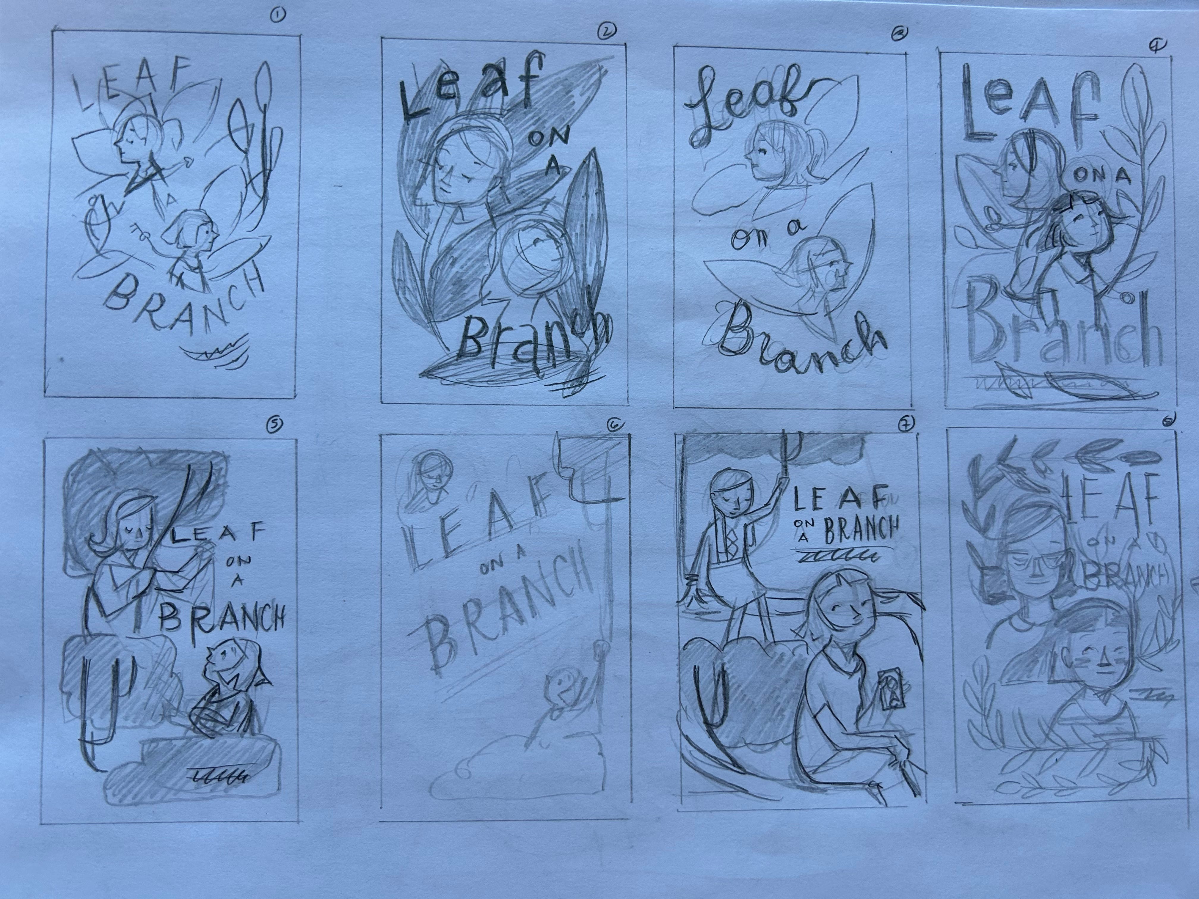
4. Annnnd more thumbnails
These are still technically thumbnails, but they’re a bit bigger, around 2 inches high. At this stage, I’ll take the first round of thumbnails, identify which sketches might work best, then develop them further. It’s still small, so I’m not spending time on a fully realized sketch. But I am beginning to think more intentionally about the overall composition and type. A caveat: typography is not in everyone’s wheelhouse and that’s absolutely understandable. My background is graphic design and I was taught to render type by hand before I was ever allowed to use the computer. At the time (2005) it seemed archaic. But the reality is that it gave me an understanding of type that I don’t think I’d have otherwise. Am I pro letterer? Absolutely not. I still break out in a cold sweat thinking of using a French Curve. But if you’re looking to get more comfortable with using type in illustration, taking the time to do a super basic study of typography is incredibly helpful (and something I should do a future post about).
5. And now…
From here, I’ll begin working on a full-size black and white sketch. Typically, I would provide an art director with a minimum of three of these, to provide options. But because I’m technically the client (ha), I’ll just go with the one design. So for an upcoming post, I’ll show how the process continues from this point.
Now I want to read this book. Thank you for sharing your process ❤️