


For the past couple of years, I’ve had the joy of illustrating an Anne of Green Gables inspired series, adapted by Kallie George and published by Tundra Books. This year the sixth and final installment in the series, Anne Dreams, comes out (Fall 2024). The final book’s publication is making me nostalgic, so I’ve been having a rummage through some of the early sketches. I thought it would be fun to share a bit about the first book’s development, starting with the cover.
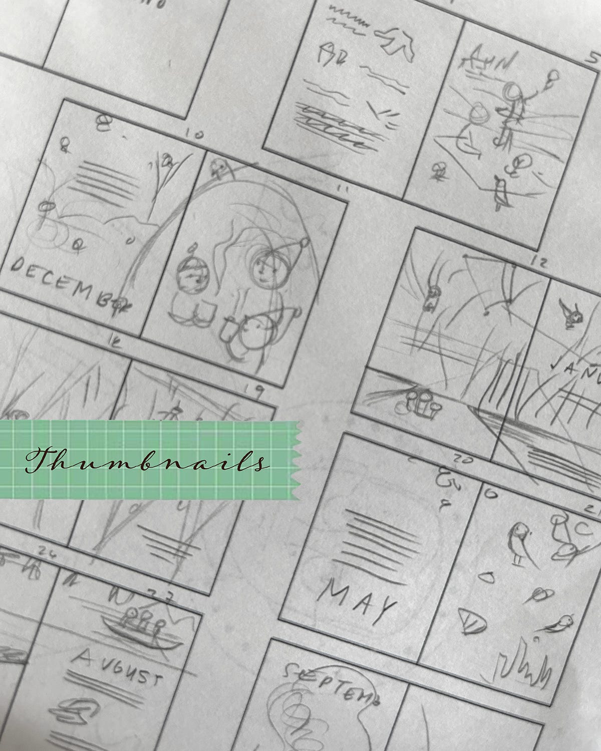
The cover for Anne Arrives started out where every book cover starts for me: thumbnails. My thumbnails are generally indecipherable to everybody but me. But the goal here isn’t public consumption, but rather a private focus on large shapes/form and rudimentary text placement. Before I invest time in actual sketches, I want to get lots of ideas down quickly on paper and this is where thumbnails come in. They will be ugly and they will be crucial (much like doing your taxes). I don’t have my thumbnails for Anne Arrives, but the above are some thumbnails from a picture book concept my sister and I worked on a year or two back. They’re representative of the looseness of the thumbnail stage.
Once I have thumbnails out of the way, I start looking to see what ideas are potentially promising. I rarely find my first few thumbnails are particularly useful; the better ideas tend to arise the further along in the process I get. At this stage, I’m thinking through several things.
Is this concept well composed? Am I incorporating the principles of design (balance, emphasis, unity, etc.).
How will this cover look at various sizes? Will it read well at a distance and attract the attention of a shopper 20 feet away? Will it be decipherable when shrunk down to an inch high in a catalogue? Caveat: I don’t think about color at this stage, just design. Color is important, but latching onto it too early can obscure design issues. For me, sticking to black and white while establishing design is crucial.
How am I incorporating type into the art? This will be something that an illustrator will iron out with the art director at a later point and most often, you don’t need to go too far down the typographic rabbit hole. The most important thing though is to be mindful of how the art will interact with words and to take into consideration that relationship. As a side note, I love hand-lettering and my background is in publication design, so I do tend to incorporate more fully rendered text into my early sketches. But this is personal preference and definitely not a universal necessity. You do you.
Once I’ve chosen a couple potential covers from the thumbnails, I begin doing some more refined sketches. I typically am still working smaller than full size (about a quarter of the print dimensions). This is a step up from the itty-bitty thumbnail, but still not so big that I’m being slowed down by size. I then take these more refined sketches and begin work on the actual sketch that I’ll show an art director.
For cover sketches, I present at minimum three concepts in greyscale. In the case of Anne, I did five. Because Anne Shirley is such an iconic character, I was conscious of really taking the time to get the cover just so.
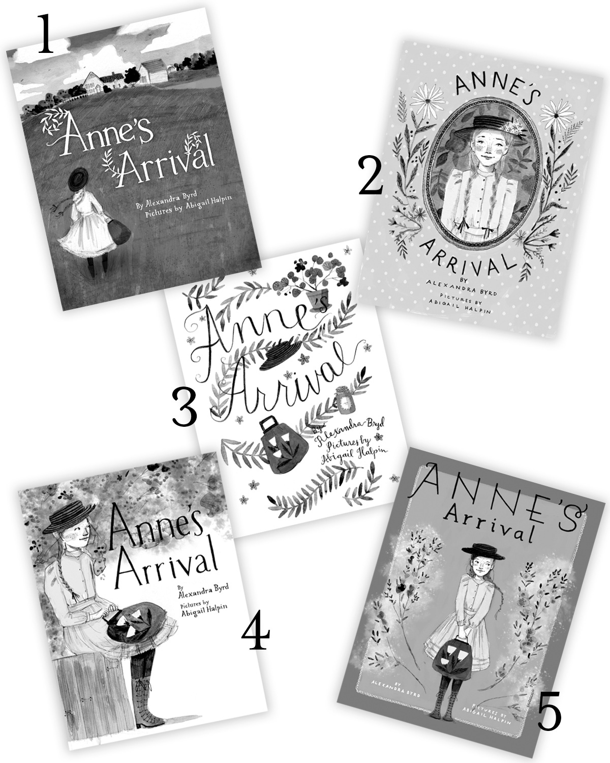
Looking back at these covers, it’s fun to see what worked/didn’t. I think Option Option #1 is nostalgic, but with Anne facing away from the reader, there isn’t an emotional connection with her character. Option #3 is very type dependent and in retrospect, isn’t a good fit for the target age group. I do like Option #4, but it lacks a dynamism with the seated position. But several years later, I feel Option #2 and #5 still hold up. Anne really gets the focus she needs. And both covers work well as part of a series. In contrast, Option #1 feels more like a one off, not part of a larger body of work.
Once sketches were sent in, art and editorial had a chance to review them. From here, we began the revision process, adding and subtracting, trying new ideas and jettisoning old ones. It took a bit to get right, but you can see how at a point, the cover began to take shape more concretely. Once the composition was stable, I began to add some color to the sketches, to see how that was shaping up. The color palette did shift a bit as we moved along, but not radically.
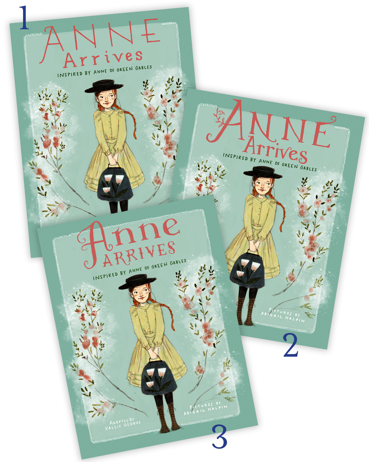
Closer and closer and closer. At this stage it’s easy to get a little burnt out, but it’s this final fine-tuning that really pushes a cover over the finish line. One of the biggest shifts during this part of the process was the type treatment. My handlettering for the byline and “inspired by…” remained, but by the final, we had switched to a typeface for the title. I did trace and paint the typeface, though, which gave it an organic feel.
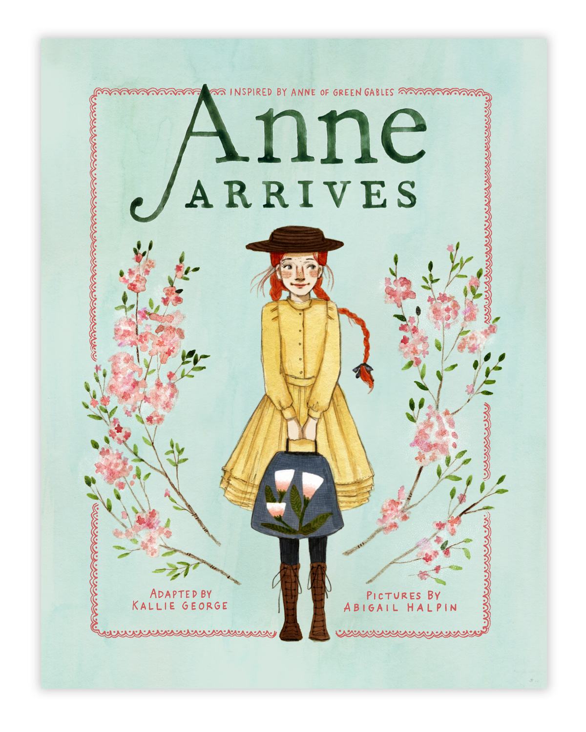
And the final! If you look at this cover alongside Anne Dreams, you can see that the two covers invert color schemes, an intentional hat tip to where the series began and where it ends. I love how lanky and awkward Anne is on the first book and the confident, charming young woman she becomes by the final.
And it all starts with a sketch. Or 30.